The shopify.com/free-trial landing page is the most-visited page on the whole website. But it was stuck in a design from 2016. We moved it into the modern era and created a better user experience by leading the project from a content design-first perspective.
My role: Product lead, content design lead, UX design partner, QA tester.
The situation
People go to Google and type in Shopify. They’ll often see an ad like this:
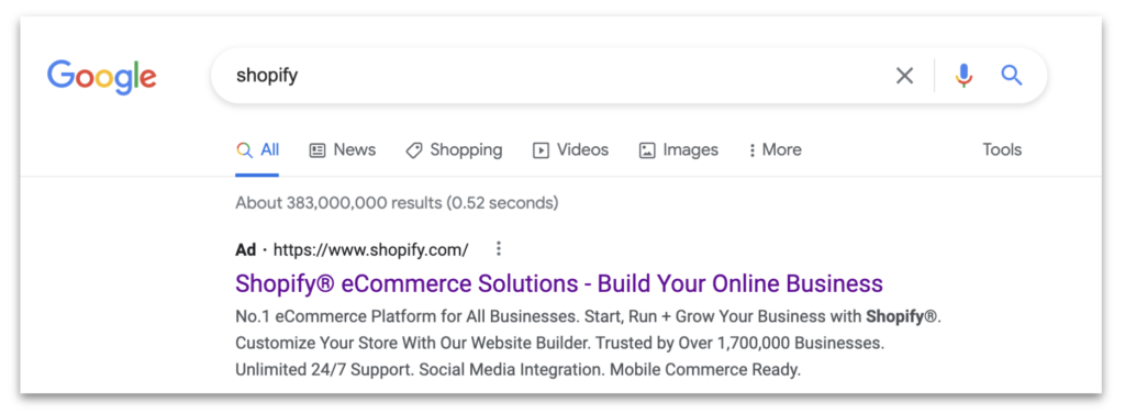
If they click that link, they’d arrive at this landing page: shopify.com/free-trial:
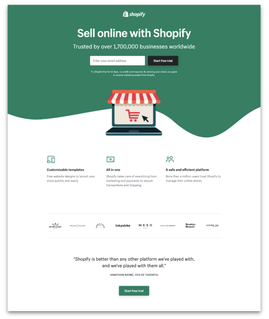
This page is valuable real estate. In fact, it’s the largest driver of leads, prospects, and merchants. About 61% of SEM traffic gets sent here, accounting for $150,000,000 of ad spend.
The complication
The /free-trial landing page was outshined by the competition. It was 76% smaller than the average competitor landing page.
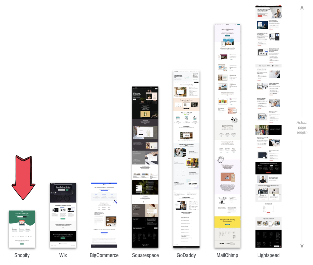
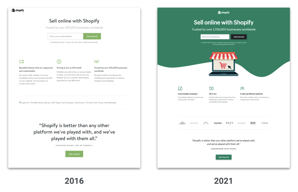
This page was also outdated, remaining largely unchanged since 2016:
The question
How do we modernize this landing page?
The answer
We reimagined this page with a greenfield approach.
In many disciplines, a greenfield project is one that lacks constraints imposed by prior work.
The analogy is to that of construction on greenfield land where there is no need to work within the constraints of existing buildings or infrastructure.
From Wikipedia
To succeed, Shopify needed to create a bold, new landing page from the ground up, all at once. It was a shift from slowly iterating on a page over time to launching a vibrant, right-sized page from the start.
The process
I led this project overall, from timelines to resources to leadership reviews. We kicked off the creative work with the process of crafting three new concepts, each with a different user need. Starting with the greenfield blank slate, I first set each concept intention, then outlined the information architecture, paired with a visual designer, and crafted the page content.
Working with a UX research team, I helped run the concepts through two rounds of user research to ensure that our work was based on real users in real situations.
The work: Three concepts
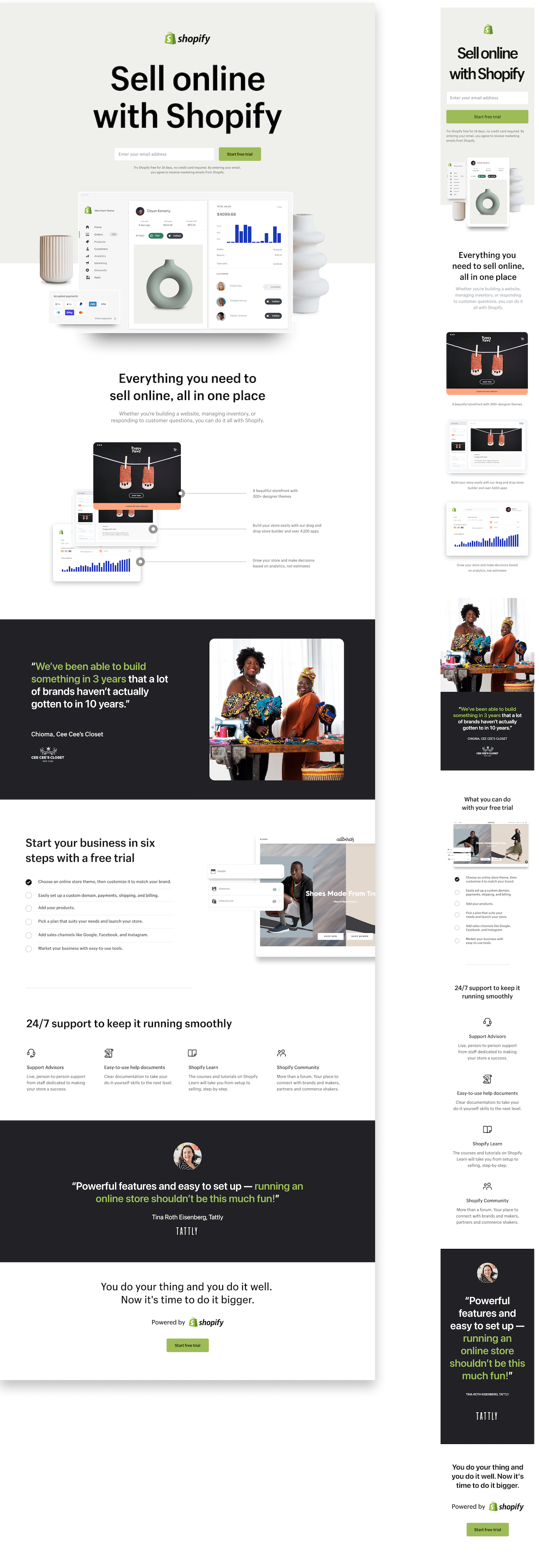
Concept one: This is Shopify.
Research showed that people seek specific information before committing to a free trial. None of that info was on the control page, so we put it in this page template.
- Includes the most info of all three concepts
- Retains the same top-level messaging as the old page
- New emphasis on support to build merchant confidence
- Adds the detailed the step-by-step setup process
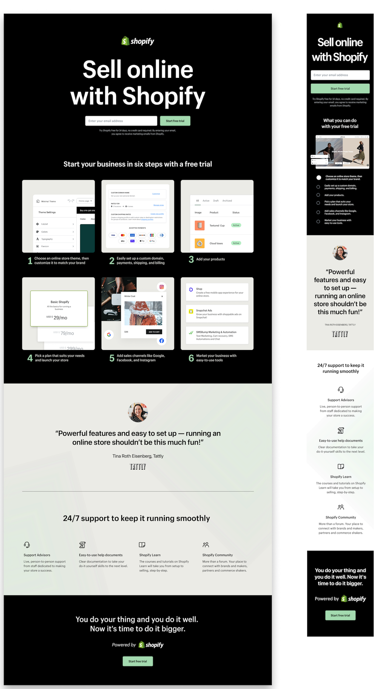
Concept two: A successful business starts with a free trial
This concept features less information, but still includes the top-requested elements from the UX research.
- Focus on the steps to get started, from a free trial to selling
- The most compact concept
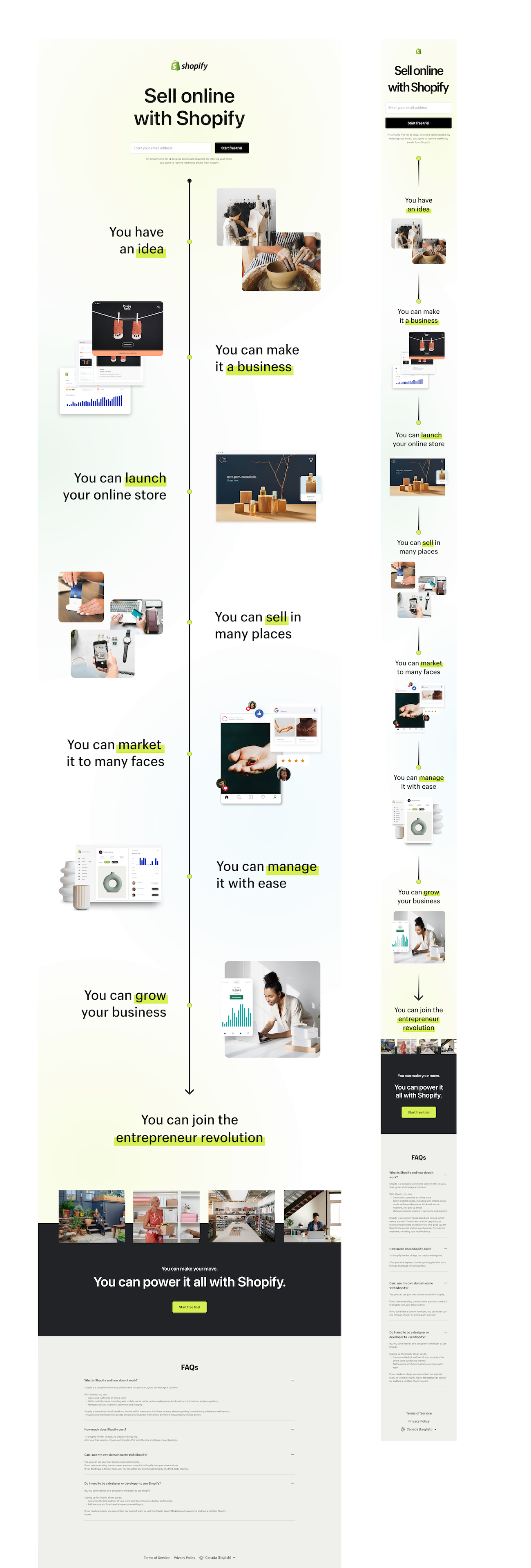
Concept three: Manifesting for merchants
This was the biggest departure of the lot, discarding almost all of the past versions for a bold, new presentation.
- Focus is on building merchant confidence
- Emphasis on conversion, rather than providing info
- Broke free of past guidelines and followed a more narrative approach
The experiment
A shift like this is a risk, so we carefully tested our new concepts in an experiment along with the control. I worked with a Growth Marketer to fine-tune the test, splitting it out by template and keyword type to provide detailed insights.
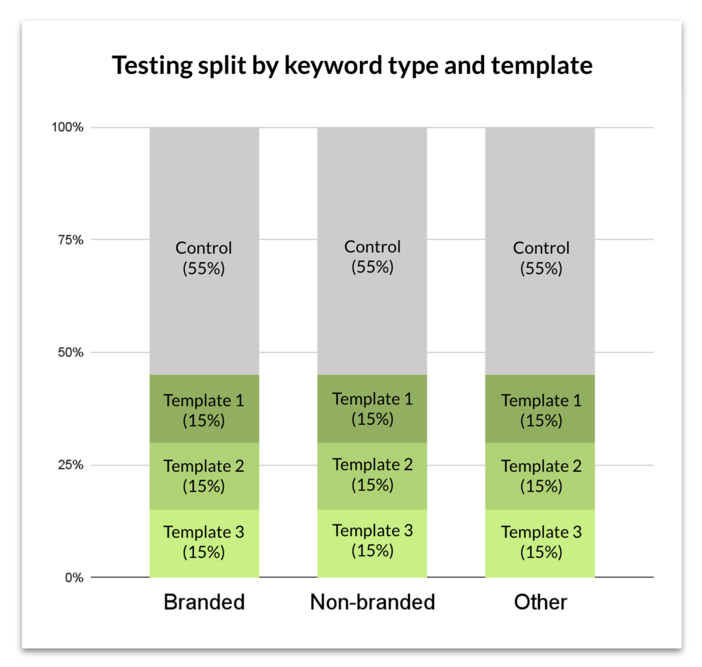
The results
The third template was the winner, though a full roll-out wasn’t initiated after the results came in. It was rolled out in certain markets where it outperformed the control group.
One of the biggest outcomes of the project was establishing a new way of working, with content design leading the proceedings. We demonstrated the value of content design to a new working group, and elevated the discipline to a new level. At the project close, we had earned our seat at the table.